Tuesday, April 15, 2014

Last Usability Test

Welcome
Welcome to the usability evaluation of hub squared. Thank you for taking time to be a part of this evaluation. My name is ________. We're working on the design of this site and want to identify usability issues. We're testing the site, not you. There are no wrong answers so feel free to speak freely about the site. I'm going to ask you to complete a series of tasks which will take about 20 min. I'll be asking you to please think aloud as you work, saying what you are thinking and how you think the site functions. This is voluntary and you can stop at any time. Do you have any questions before we begin?

Tasks
1) Please Log in as a guest
2) Look for information about this site
3) Click in one of the classes that you have previously added
4) Look for class specific materials
5) Looked for videos relevant to your class
6) Engage in a discussion with all your classmates
7) Engage in a discussion with your project group
8) Please log out

Questionnaire
1) Do you think a collaboration website would be useful to you?
2) Did you have trouble navigating the site?
3) Did you feel like you had to leave our site at any point to look for additional information somewhere else?
4) How do you feel about the layout?
5) Are there any parts of the site that are confusing to you?
6) Do you have any additional comments or suggestions?

Conclusions from class evaluation
From this evaluation we found that it wasn't clear why the "Always Linked" button refereed to. This is the second time a user mentions the same thing so we will definitely be changing it to something more descriptive. So far we might be changing it to "relevant links" or maybe just "links".  According to the user, everything else was clear and the layout was consistent. Even though she had no trouble locating the contact information we want to add a still footer to the layout. That way the contact information would be always in view.  She also mentioned how she would definitely use the site for bigger lectures. We might change the site description to make it more concise. The user felt that the description paragraph was too long and she probably wouldn't read it. In general, she thought that the layout was clear, consistent, and the website very useful.

Wednesday, April 9, 2014

Updated Usability Testing Script_02

Welcome
Welcome to the usability evaluation of Flip Side! Thank you for taking time to be a part of this evaluation. My name is ________. We're working on the design of this site and want to identify usability issues. We're testing the site, not you. There are no wrong answers so feel free to speak freely about the site. I'm going to ask you to complete a series of tasks which will take about 20 min. I'll be asking you to please think aloud as you work, saying what you are thinking and how you think the site functions. This is voluntary and you can stop at any time. Do you have any questions before we begin?

Tasks
1) Please Sign up for this site and then sign in
2) Look for information about this site
3) Look for discussion messages within your Design 5405 class
4) Look for class specific materials
5) Looked for videos relevant to your class
6) Engage in a discussion with your project group
7) Complete any other task of your choosing
8) Please log out

Questionnaire
1) Do you think a collaboration website would be useful to you?
2) Did you have trouble navigating the site?
3) Did you feel like you had to leave our site at any point to look for additional information somewhere else?
4) How do you feel about the layout?
5) Are there any parts of the site that are confusing to you?
6) Do you have any additional comments or suggestions?

Conclusion From 1st Evaluation:
Subject: R.H.
Major: Classics (full time transfer at OSU)


The first usability test was not the best, as R.H. was unfamiliar with the interface of the computer used for testing (a MacBook Pro). He did not wait until the questions were asked, but went on with exploring the site. He had relatively low standards for evaluation; he said that the site was good because all the links worked and led to the right places, and that content was missing but that this is ok because he can tell that the information will be filled in.

Conclusions From 2nd Evaluation:
Subject: E.C.
Major: Computer science (on and off student at community college)


 The unfinished nature of our site comes to the fore; E.C. asked why there was a floating [logo] in front of the logo. He was confused by the sign-in, because he didn't know what the site was.

He was unsure whether the relevant videos could be found under Discussion or Class Links.

He pointed out that the discussion comment box lacked a submission button...

There was a bit of hesitation before clicking into Private Chat for the project group discussion. "We meet again, Person 1," quipped our subject.

The logout was self-explanatory.

Our subject would not find our site useful because there are more specific sites for most of the topics he has. He said that navigation was easy and fairly well labeled. The layout was too wide for his taste; he thinks that spreading things across three columns is too wide of a layout and is unnecessary. The two sets of links bars (the class-specific tabs and the sidebar links) are somewhat confusing.


Conclusions From Third Evaluation:
Subject: J.C.
Majors: Political Science, Security and Intelligence, full time transfer


Without context, J.C. was confused ("I have not signed up for this witchcraft"). He said the button did not jump out at him.

The most obvious part of the homepage is the classes; the user skipped ahead before I asked him to look up information about the site. (Looking up the information about the site did not seem relevant to him, so he didn't).

When I asked him to look up a video, he could not find a video (because the site did not have an actual video). He looked in other classes, but to no avail. (Testing incomplete products has its hazards.) The (class) materials links was somewhat unclear, I think.

J.C. would have found the site useful at a different time, when he had groups that he wanted to work closely with (he does not like being in constant contact with work associates).

The unselected links were somewhat hard to see (the colors "did not jump out" at him). Navigation itself was fine. The site is fairly well designed and he can find things once he notices that a link is there.

Conclusions from 4th evaluation 
Subject: Tony
Major: Non-traditional extended learning student (Statistical analysis studies)


Tony liked the colors chosen for the site. He thought the navigation was pretty straightforward. When asked about the organization of the site, he said that the organization some pages maybe could be a little better. For example, he noted that on the Links page the 'search' and 'add new' buttons maybe could be smaller and off to the side, in order to highlight the 'top-viewed' videos. We asked what he thought about the idea of creating a default page (such as 'discussions') when clicking on a class, and he said it is better the way that it is, since you may sometimes want a different page first. He also noted that it would be a good idea to put notifications of updates, such as when you receive new messages or new links or posted (and that maybe these notifications can be turned off if the user so chooses.) In conclusion, if we want to make this site more organized for the user, we will change the layout of some of the pages in order to highlight important and useful information. Also, if we wish to make the site as useful as possible, we will create notifications for the updates.


Thursday, March 27, 2014

Updated Usability Testing Script

Welcome
Welcome to the usability evaluation of hub squared. Thank you for taking time to be a part of this evaluation. My name is ________. We're working on the design of this site and want to identify usability issues. We're testing the site, not you. There are no wrong answers so feel free to speak freely about the site. I'm going to ask you to complete a series of tasks which will take about 20 min. I'll be asking you to please think aloud as you work, saying what you are thinking and how you think the site functions. This is voluntary and you can stop at any time. Do you have any questions before we begin?

Tasks
1) Please Log in as a guest
2) Look for information about this site
3) Click in one of the classes that you have previously added
4) Look for class specific materials
5) Looked for videos relevant to your class
6) Engage in a discussion with all your classmates
7) Engage in a discussion with your project group
8) Please log out

Questionnaire
1) Do you think a collaboration website would be useful to you?
2) Did you have trouble navigating the site?
3) Did you feel like you had to leave our site at any point to look for additional information somewhere else?
4) How do you feel about the layout?
5) Are there any parts of the site that are confusing to you?
6) Do you have any additional comments or suggestions?

Conclusions from 1st evaluation
From this evaluation we found that it wasn't clear why the "About" link and the "Contact us" link led to the same page. We might want to divide the information into two separate pages or eliminate one of the tabs. We would also like to relocate these tabs to the bottom of the page into a footer, that would show up on every page. This might help the main navigation be more clear, if there are less tabs to choose from. The user encountered a blank page when she selected her class, and then had to select one of the tabs to choose what she wanted to do. From this, we realized it would be useful to make one of the tabs a default, which would show up automatically after selecting a class. We decided that the "Class Discussion" tab should be the default tab, since it would most likely be the most used tab.

Conclusions from 2nd evaluation
From this evaluation we found that the syntax of some of the tabs were confusing. In order to make it more understandable, we might want to change the "Always Linked" tab to be called "Relevant Links" or "Useful links". The user found that the navigation was understandable for the most part, and that the other links made sense. She also commented that a collaboration site might have been useful to her during her first couple years of college, but as a senior student she would not use it. For this reason, we should redirect our focus on 1st or 2nd year students or students that have classes with large lectures. We might also focus attention on transfer students. The user also liked being able to log in as a "guest" so that she didn't have to create an account in order to view the site.

Tuesday, March 25, 2014

Plan for Usability Testing

Our target audience is the student population at OSU, so we will look for random students on campus who would be willing to test our wireframe. 

There are many ways to solicit these individuals to take the usability test. As a start, we will be sending emails to all our classmates from all the classes we are taking this semester. All three of us have different majors and classes so we would be reaching a wide range of students with different interests, such as business, arts, engineering, english, and design. Secondly, we will be sending messages on Facebook to the friends we know attend OSU. And finally, we will be approaching students personally with a laptop on the Oval. That way we can achieve a wide range of tests from different perspectives. 

Since the paper-prototype version of the website, the only thing we really changed were the side tabs we had which sat vertically on the page. We realized that it was hard to read the vertical text and that it would be easier for the user if we moved the respective tabs to the top of the page with regular horizontal text instead. 

After the paper wireframe exercise done in class we were able to further observe that there was indeed a certain level of discomfort when students tried to read the tabs vertically. That wouldn't change our script, however, our design layout changed a little. As mentioned before, we moved the side tabs to the top of the page. 

Thursday, February 27, 2014

Usability Evaluation Script

Welcome
Welcome to the usability evaluation of hub squared. Thank you for taking time to be a part of this evaluation. My name is ________. We're working on the design of this site and want to identify usability issues. We're testing the site, not you. There are no wrong answers so feel free to speak freely about the site. I'm going to ask you to complete a series of tasks which will take about 20 min. I'll be asking you to please think aloud as you work, saying what you are thinking and how you think the site functions. This is voluntary and you can stop at any time. Do you have any questions before we begin?

Tasks
1) Please sign in
2) Add a Psychology 100 class
3) Add a discussion question within your Design class
4) Search for a linked video about usability testing
5) Please search for a book for your Business Management class
6) Please log out

Questionnaire
1) Do you think a collaboration website would be useful to you?
2) How do you feel about the navigation of the site?
3) How do you feel about the layout?
4) What task was most difficult for you?
5) Do you have any additional comments or suggestions?

Conclusions


Even before the usability test proper, we noticed problems with our site. In our zeal, we had omitted the Class Search/Add page.

The front page apparently gives no indication as to the purpose of the website. If the user is to know what our website is about, we should add a description on the homepage.

We asked the user to add a class site; she thought that the Department and the Class number search bars were for entering parts of the same class abbreviation (e.g. that she was to choose Psychology for the department and 1001 for the class number). Our search bars were meant to be separate; the Department drop down list allows users to search by department (e.g. find all results within the Psych department); the Class search list allows the user to find all results in a particular class. To make this clearer, we could add an example above the class search bar.

The user was not sure how to add a new discussion topic because our page did not have a button to press to add a discussion topic. Additionally, the user was unclear on which functions were possible on the discussions page; if our audience is to understand what’s going on, we need to make the different functions clearer.

The Always Linked page was straightforward.

We asked the user to search for a book. The Materials tab is easily found, but the search format is unclear (department? title? ISBN?). This will be more clear if we clarify the preferred format(s) above the search bar.

The logout and overall navigation made sense overall. The user asked what the difference was between searching for materials in the class tab and using the main search bar. We think that the site would be improved by only keeping the contents of a class in the box, as this will visually distinguish between activities done within a class and other searches/activities on the site.

Monday, February 3, 2014

User Research, Competitor Analysis, Personas

User Research Summary:
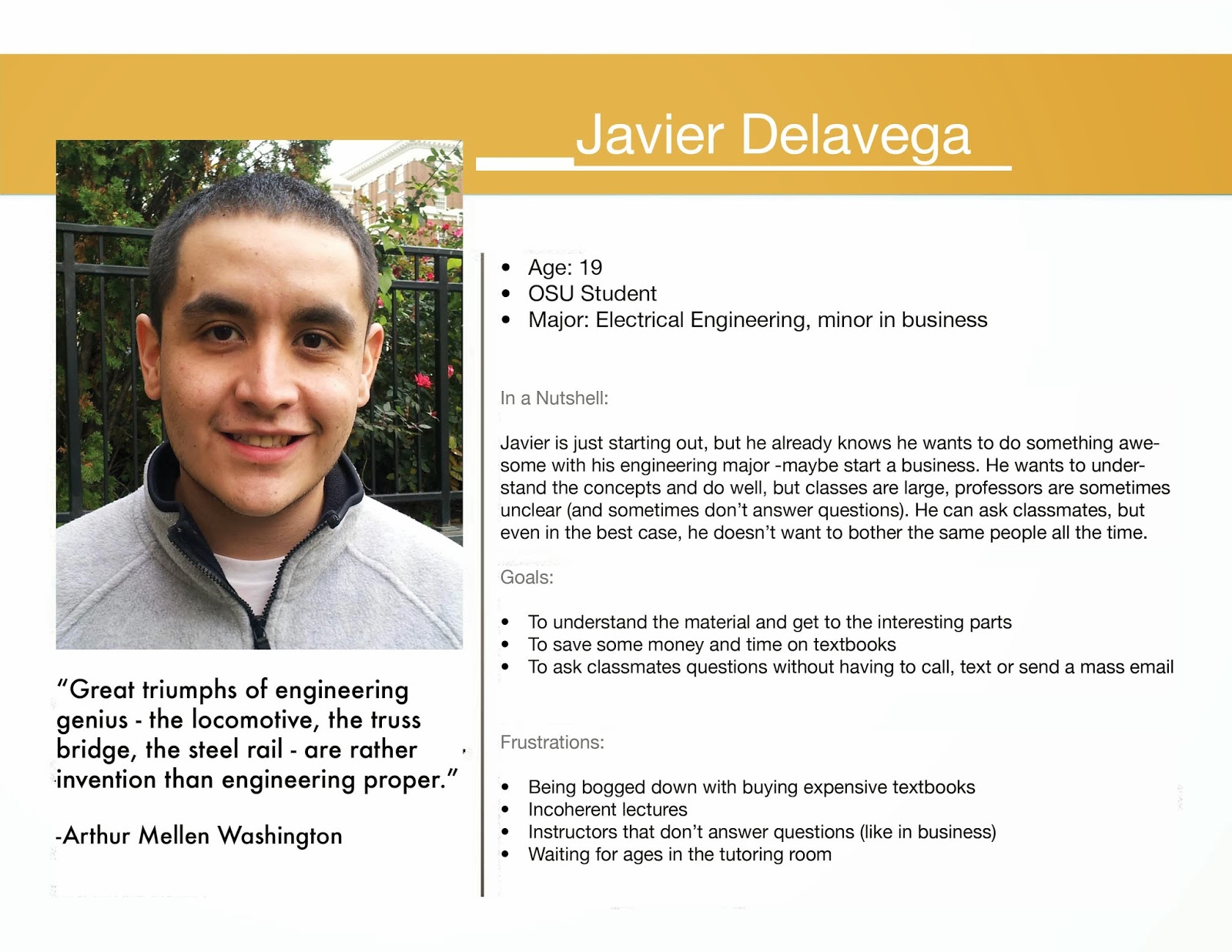
Our research involved surveying students of different ages at Ohio State to determine the wants, needs, and behaviors of our user group. We used SurveyMonkey to do so, and received 25 responses. The summary of our results are as follows:

Demographics:

  • Majors: Biology, Education, Medicine, Engineering, Sociology, Economics, Design, Marketing, Theatre, Neuroscience, and Sport studies
  • Year in college: 8 in their first two years of college, 14 are in their second two years, and 3 are graduate school
Wants/Needs:
  • 84% responded that it would be helpful to have a site where students can share notes and other relevant resources.
  • Participants responses varied evenly when asked if they would be likely to join a study group with members of their class; About a third responded that it is likely, a third responded that is maybe likely, and a third responded that it is not likely.
  • 44% responded that they sometimes feel unsure how to get help when taking classes with large lectures or large class sizes.
  • 40% of participants admitted to feeling uncomfortable approaching classmates for help in person or by email.
Behaviors:
  • When asked how they look for help when they are having trouble in a class, 52% ask the professor for help, 56% ask students in their class, and 48% ask friend or family. Also, 92% of participants look on the internet for help, versus only 24% that said they go to tutoring centers.
  • 80% of participants responded that they are okay with being approached by classmates for help or that they enjoy helping their classmates.
  • 19 out of 25 participants said that they sell at least one book at the end of every semester, where 15 of those sell some or most of their books, and 4 sell all of their books.
  • 72% of the participants prefer to buy books online through Amazon or other websites, 24% prefer to buy books from OSU bookstores, and the remaining 12% prefer to use other methods (where 0 of the 25 participants reported that they prefer to use MarketOSU).
Competitor Analysis:


First As-Is Analysis: MarketOSU
MarketOSU is a website only for OSU students that allows students to post books, sporting event tickets, and other event tickets that they would like to sell. Students can search for items that they wish to buy, and can then contact the seller.

1. Visibility of system status - The system status and navigation is pretty straightforward due to the simplicity of the site. The title of the page is on the top. It may be confusing to people that you can switch pages either by going back to the home page, or by using the drop down menu. On the mobile site, it is confusing which words are links and which are not.

2. Match between system and real world - The site uses terms that are easy to understand. The main pages are accessed by links titled "books", "basketball", "football", "events", and "watchlist".

3. User control and freedom - It was not clear to me at first how to return to the home screen from the page I was on, which made me feel that I didn't have control over the website at all times. Also, there is a "watchlist" feature, but I was unsure how to add items to the watchlist.

4. Consistency and standards - The site has separate links for "browsing" and "searching" which is confusing to me since most sites have both these functions on the same page. In fact, MarketOSU does have a search bar on the browse page, so I'm unsure why it is necessary to have an additional link to do this.

5. Error prevention - The site allows you to sign up to use the site, and then sends you a confirmation email for verification. This assures that you are signing up with the correct email.

6. Recognition rather than recall - The available actions are clearly visible on the home page. The site has a limited amount of functions, which lessens the amount of information to recall. Also, the functions have pictures along with words so it is easy to recognize where to go.

7. Flexibility and efficiency of use - The site has a limited amount of functions, so it doesn't cater to inexperienced users any differently than experienced users. There is a "watchlist" function that allows users to place items there and come back to them later, which may increase efficiency of use. There's also a mobile version of the site which is intuitive to use if you have previously used the site.

8. Aesthetic and minimalist design - The site does have a minimalist design. It has a plain white background and has a minimal amount of text. There are advertisements that are somewhat distracting. The design could probably be more aesthetically pleasing.

9. Help users recognize, diagnose, and recover from errors - An error message is given if the wrong username or password is used to sign in. However, it does not give any instruction on what you can do if you forget your password. Also, if you are selling a book and if you cannot find the book by searching it's ISBN, you can manually add the book.

10. Help and documentation - MarketOSU has a Frequently Asked Questions page that has answers to a few questions that users might have. It also has a page that lists contact information. However, there is no page that provides an extensive amount of help.

     We determine if a site is good if it allows us to find what we are looking for easily and quickly. This site is effective because it has a simple design that allows users to accomplish tasks (such as sell and buy books and tickets). The site also uses terms that are easy to understand and does not use excessive amounts of text. The site is flexible for users since it has a mobile version if the site, however, the mobile version is not entirely intuitive. Also, the user may have to use the site multiple times before fully understanding all the functions. Overall, the usability of this site is good (possibly due to its limited functionality).

Second As-Is Analysis: Discussion Boards on Carmen
Although OSU Carmen's Discussion Board isn't a website, it is the closest service we found to our Student Board, a place where students can exchange information about their classes and homework. For that reason we found it was relevant to analyze Carmen's Discussion Board.

1. Visibility of system status - 
The Discussion Board is easy to find and pretty straightforward, right under the Activities menu. The mobile version is a lot more challenging. In order to even find Carmen you have to switch to the desktop version.

2. Match between system and real world -The language is simple and easy to understand. The messages can be sorted by "unread" and "read", as well as "shared".

3. User control and freedom -It is pretty clear how to go back and switch to another class to enter a different discussion board. All a student has to do is click on the class name on the top left hand corner to return to the class menu, or click on "Home" also on the top left hand corner to return to the Carmen menu and select a different class.

4. Consistency and standards - The Discussion Board is really simple and it doesn't have many commands. Although it is consistent, it very limited on what it offers. 

5. Error prevention -Since it is very limited there isn't much room for error. A message pops up after you post a comment to let you know it was successfully posted. However, it does not let the student know when someone replies to the post. The student has to keep checking to see if there are any replies.

6. Recognition rather than recall - The Discussion Board doesn't have many function so it easy to remember where to go and what to do.

7. Flexibility and efficiency of use - The Discussion Board is very limited in its function so it doesn't tailor to unexperienced users any differently than to experienced ones. 

8. Aesthetic and minimalist design - The design is very minimalistic. The background is white on gray. It looks like a paper page with two tabs on the top. It isn't very aesthetically pleasing. It looks really boring and plain.

9. Help users recognize, diagnose, and recover from errors - To access the Discussion Board the student needs to first log into Carmen. Carmen gives out an error message if a wrong user name or password has been typed. On the right side of the screen there is a list of questions students can click on that will help to reset the password in case it has been forgotten. 

10. Help and documentation - The Discussion Board has a "Help" tab that informs the student of its purpose. It doesn't allow the student to ask questions or receive answers. It is not interactive and not helpful at all.  

The Discussion Board is mainly easy to use. However, it doesn't have many functions and it is very limited on what it offers. I couldn't figure out a way to make any posts on some of my classes so I am assuming that the Discussion Board has to be activated by the instructor before it can be used by the students. Overall, the Discussion Board is easy to use but extremely limited.

Third As-Is Analysis: OSU Reddit
Reddit is a site where anyone can post questions, and those that visit the site can either post replies to questions or view the questions and replies of others.

Visibility of System Status - It is fairly easy to recognize what page you are on and where links take you.

Match between System and real world - Most of the content is user-generated, so most of it matches the real world. There are reddit-specific terms (upvote, subreddit) but they are not technical. 

User control and freedom - It may be hard to find exactly what you are looking for. There are many tabs and also a search tool that should help, but it is hard to know exactly where to start.

Consistency and standards - Same structure and conventions are kept to throughout the site. Subreddit moderators have some control over visual elements (e.g. r/osu has buckeye leafs instead of arrows for upvotes and downvotes and a scarlet header with Brutus Buckeye).

Error prevention - There are not many errors that can occur while making or viewing posts.

Recognition rather than recall - It is easy to recognize where to go to search for topics or to create a post. However, if you are looking for a specific post, you may need to use recall to remember where the post was or what category to look under to find it.

Flexibility and efficiency of use - Allows users to search for specific topics or filter the posts basd on what is currently trending.

Aesthetic and minimalistic design - The design if this site is busy and somewhat distracting. There seem to be extra patterns and symbols that may distract the user and take away from the aesthetic appeal. There aren't too many colors used which is good.

Recognize, diagnose, and recover from errors - The numbered errors (e.g. 502, 504) are just plain text and do not explain what the error is. When the site is overloaded, however, the error message is in plain language and accompanied by a funny illustration.

Help and documentation - There are frequently asked questions and a contact information page, which is helpful.

It is fairly intuitive how to post questions and replies on Reddit. However, it may be difficult to search for exactly what you are looking for, especially if you don't want to duplicate a question that has already been asked and answered. It is ideal for those who want to browse and explore the site, but not ideal for those looking for specific things (unless they post a question and then wait until someone replies).

Consensus:
MarketOSU is a good place to sell and buy books, sports tickets, and event tickets. You can search for a book by title or ISBN, but cannot search by class. There is also no way to discuss with other students what materials are needed or are available for certain classes. #help will also allow students to buy and sell books and materials, but will be organized int a way that students can search for books by the class that they are in. The site will also strictly have an academic focus, allowing students only to sell books and other relevant classroom materials.

Carmen has a discussion tool that can be used in each class, but in spite of being easy to use, it is not very efficient. Students most of the time resort to mass emails when they have questions.Instructors don't usually activate the Discussion Board unless it is part of their requirements that students make comments and reply to one another on a particular subject, and that is usually the only time that students will use the Discussion Board. Some teachers don't even use Carmen at all. Also, these discussions are not checked by students very often and questions posted on the Discussion Board often have a very slow response rate. #help aims to have a discussion board that can be used by students whether or not their teachers activate the Carmen page for the class or activate the discussion boards. #help will be a site where students can feel comfortable posting questions. It is also completely optional, so only those who want to be involved will receive notifications, but those who do not wish to participate will not be bothered (especially by mass emails). 

OSU Reddit is a good way to ask and browse questions or post news, but this site is not specifically limited to OSU students. Anyone can make an account which brings up security/privacy issues. Also, the discussions on this site are very broad, and students don't tend to use it for classroom help. #help! aims to create a site where discussion threads are limited to OSU students and the posts are meant only for relevant classroom material. Students will be able to collaborate with students from their class, and will not have to rely on information from strangers.

#help aims to combine functions and resources that each of these sites provide (such as material and information sharing), while making it easier for students to collaborate with classmates by narrowing the focus to classroom help/discussions and classroom materials, and is only available to be used by OSU students.


Personas:


Wednesday, January 22, 2014

Tuesday, January 21, 2014

As is analysis by Anna Shvetz: OSU Reddit

Visibility of System Status
It is fairly easy to recognize what page you are on and where links take you. 

Match between System and real world
Most of the content is user-generated, so most of it matches the real world. There are reddit-specific terms (upvote, subreddit) but they are not technical. 

User control and freedom
It may be hard to find exactly what you are looking for. There are many tabs and also a search tool that should help, but it is hard to know exactly where to start.

Consistency and standards
Same structure and conventions are kept to throughout the site. Subreddit moderators have some control over visual elements (e.g. r/osu has buckeye leafs instead of arrows for upvotes and downvotes and a scarlet header with Brutus Buckeye).

Error prevention
Reddit has errors but not a lot of them.

Recognition rather than recall
The Help and FAQ sections are at the bottom of each page.

Flexibility and efficiency of use
Allows users to search for specific topics or filter the posts basd on what is currently trending.

Aesthetic and minimalistic design
The design if this site is busy and somewhat distracting. There seem to be extra patterns and symbols that may distract the user and take away from the aesthetic appeal. There aren't too many colors used which is good.


Recognize, diagnose, and recover from errors
The numbered errors (e.g. 502, 504) are just plain text and do not explain what the error is. When the site is overloaded, however, the error message is in plain language and accompanied by a funny illustration.

Help and documentation
There are frequently asked questions and a contact information page, which is helpful.

Charter Reevaluation

1. Business Goals

The main goal of this website is to provide a concise and effective service to OSU students. It's a place where they can meet people from their classrooms and exchange information such as classroom notes, ask and answer homework questions, receive feedback on projects in progress (such as art and design pre-critiques) and exchange materials.

In order to do provide a free service to students, there will be a space where advertisers can pay to place ads. Those ads would be tailored to our specific target audience. For example, there will be food advertisements (especially for healthy food) and bookstore advertisements. These funds will be used for the upkeep and improvement of the site.

2. Website Goals

The website will provide relevant information in an effective way to students in need of homework help, and provide a platform for students to sell/buy/exchange books, notes, and other materials (that do not break plagiarism rules!)

The website will have a relatively simple layout, so that students can navigate the site and accomplish tasks easily. Since using this site is optional to students, if it is too confusing then it won't be helpful and students won't use it. The site will be easy to sign into (using your OSU username and password) and it will be easy for students to add themselves to their respective classes. Students can choose if they wish to receive notifications via email or not.

The site will allow students to post resources from other websites (such as YouTube and Khan Academy). There may be a feed for student posts that imbeds videos from outside resources directly into the feed, or the fed may contain an ongoing list of links to take the user to these outside resources.

3. User tasks

This website will provide students with the opportunity to sell their used textbooks, materials, and class notes, as well as the chance to buy materials directly from other students. By avoiding the middleman (bookstores), student will be able to get more money when selling, and pay less when purchasing materials.

There will be a "board" where students that excel in a particular school subject and wish to make extra cash through tutoring can advertise tutoring classes. We would not change for students to advertise tutoring classes. As we mentioned before,  food and books advertisers would be the only ones paying to advertise.

There will also be a space where students can add themselves to a group chat (by searching their class number and using their OSU login name and password) where they can seek help from other students regarding specific classes. This is a way to meet other students and help each other get through a class. The content would be exclusively school related. At the end of every semester every group would be deleted and new ones would be created for the following semester.

Group chats for art and design classes will have an extra feature that will allow them to post their work previous to class critic days. That way students can get feedback on their work before they submit it for class critics.

We will create a space where students can post links to relevant sites such as the Kahn Academy. The information of this space will not be deleted at the end of every semester, they will remain there for the future students to have access to.

To provide a free service to students and keep the website running we will allow ads that are tailored to the needs of the students to be posted on the website. We don't have a set cost yet. We will create a package cost that would state the cost per ad/space. Food dinners and bookstores would pay to place their ads on the website due to the high traffic of students.
4. Differentiators

MarketOSU is a site geared toward textbook and ticket exchange for students. While our site will also facilitate textbook exchange, it will also facilitate discussion, which OSU exchange does not do. However, our site will not be a place to trade tickets because it will be focused on academics. Both our site and MarketOSU will be tied to users' OSU accounts to keep out random people that are not students.

Reddit is a platform where links and/or text can be posted. Posts can be discussed in the comments. Reddit has topical subforums, known as subreddits. A subreddit can be dedicated to a broad or narrow interest (e.g. r/news, r/pics, r/cooking, r/glitch_art), a format of discussion (e.g. r/askreddit, where people ask and answer questions), or a geographical area, among other things. There is a subreddit for OSU (r/osu), where students and occasional faculty members discuss OSU-specific things. Members ask questions ("Is campus internet down for anyone else?",  "Can anyone tell me some perks of being a first year FisherDirect student?",  "Healthy Eating on campus?") give useful information ("Columbus Zoo admittance is FREE tomorrow!", "Do NOT rent through Craig King Realty") and generally discuss news and share triumphs and complaints. An advantage our site can have over r/osu is structure: r/osu is a catch-all for all OSU-related topics and is not conducive to fine-grained discussion about classes. r/osu dances on the edge of anonymity: while reddit accounts are not attached to a name, posting in r/osu makes it much easier for someone to figure out a user's identity.

Craigslist is known to everyone: a virtual bulletin board (divided by metro area) where people can buy and sell goods and services, look for jobs, and arrange events/projects. Each city's Craigslist page is divided into categories (Community, Housing, Jobs, Gigs, For Sale, Personals, Discussion Forums, and Resumes), which are further divided into subcategories. While our site will also be a well-organized virtual watering hole of sorts, it will be less sketchy (because Craigslist is useful but often sketchy), have better visual design, and be tailored towards OSU students.
 

5. Audience/behavior

The audience of this website will be OSU Columbus campus students. Students may be of any age but most students are 18 years old to mid twenties. This site may be utilized more by younger students who may be taking prerequisite or general education classes that have large class sizes. However, any student in any size class may utilize this site to find help or additional resources. Students that are less outgoing may find this as an easier way to interact with classmates. The website will be free to use with an active osu ID, since it is expected that most college students either don't have much extra money or won't wish to spend money for this service.

Students will approach this website as a way to informally and quickly find the materials or the help they need. They may utilize the site functions as little or as much as they like, whether they wish to to solely use it to find materials and other resources on the web, or wish to use it to make friends or connections in their class to ask questions or find people to work on assignments with. The site will be moderated, and the students are expected to behave with respect towards others and use ethical collaboration practices (i.e. no plagiarism). However, students are expected to feel comfortable using the website and to approach the site without intimidation. Students often do not use the Carmen discussion tool and do not utilize the emails of classmates, since they may feel awkward or will not receive replies. This site allows students to behave less formally and to not be afraid to collaborate with students or ask for help when they need it. 

Monday, January 20, 2014

As is analysis by Rhayssa Hinkle: OSU Carmen's Discussion Board

Although OSU Carmen's Discussion Board isn't a website, it is the closest service we found to our Student Board, a place where students can exchange information about their classes and homework. For that reason we found it was relevant to analyze Carmen's Discussion Board.

1. Visibility of system status
The Discussion Board is easy to find and pretty straightforward, right under the Activities menu. The mobile version is a lot more challenging. In order to even find Carmen you have to switch to the desktop version.

2. Match between system and real world
The language is simple and easy to understand. The messages can be sorted by "unread" and "read", as well as "shared".

3. User control and freedom
It is pretty clear how to go back and switch to another class to enter a different discussion board. All a student has to do is click on the class name on the top left hand corner to return to the class menu, or click on "Home" also on the top left hand corner to return to the Carmen menu and select a different class.

4. Consistency and standards
The Discussion Board is really simple and it doesn't have many commands. Although it is consistent, it very limited on what it offers. 

5. Error prevention
Since it is very limited there isn't much room for error. A message pops up after you post a comment to let you know it was successfully posted. However, it does not let the student know when someone replies to the post. The student has to keep checking to see if there are any replies.

6. Recognition rather than recall
The Discussion Board doesn't have many function so it easy to remember where to go and what to do.

7. Flexibility and efficiency of use
The Discussion Board is very limited in its function so it doesn't tailor to unexperienced users any differently than to experienced ones. 

8. Aesthetic and minimalist design
The design is very minimalistic. The background is white on gray. It looks like a paper page with two tabs on the top. It isn't very aesthetically pleasing. It looks really boring and plain.

9. Help users recognize, diagnose, and recover from errors
To access the Discussion Board the student needs to first log into Carmen. Carmen gives out an error message if a wrong user name or password has been typed. On the right side of the screen there is a list of questions students can click on that will help to reset the password in case it has been forgotten. 

10. Help and documentation
The Discussion Board has a "Help" tab that informs the student of its purpose. It doesn't allow the student to ask questions or receive answers. It is not interactive and not helpful at all.  


   The Discussion Board is very minimalistic and easy to use. It doesn't have many functions and it is very limited on what it offers. I couldn't figure out a way to make any posts on some of my classes so I am assuming that the Discussion Board has to be activated by the instructor before it can be used by the students. Instructors don't usually activate the Discussion Board unless it is part of their requirements that students make comments and reply to one another on a particular subject. And that is usually the only time that students will use the Discussion Board. It is not checked by students very often so and questions that would be posted on the Discussion Board would have a very slow response. In spite of being easy to use it is not very efficient. Students most of the time resort to mass emails when they have questions. Overall, the Discussion Board is easy to use but extremely limited.

Thursday, January 16, 2014

As is analysis by Gina Torelli: MarketOSU

MarketOSU is a website only for OSU students that allows students to post books, sporting event tickets, and other event tickets that they would like to sell. Students can search for items that they wish to buy, and can then contact the seller.

1. Visibility of system status
The system status and navigation is pretty straightforward due to the simplicity of the site. The title of the page is on the top. It may be confusing to people that you can switch pages either by going back to the home page, or by using the drop down menu. On the mobile site, it is confusing which words are links and which are not.

2. Match between system and real world
The site uses terms that are easy to understand. The main pages are accessed by links titled "books", "basketball", "football", "events", and "watchlist".

3. User control and freedom
It was not clear to me at first how to return to the home screen from the page I was on, which made me feel that I didn't have control over the website at all times. Also, there is a "watchlist" feature, but I was unsure how to add items to the watchlist.

4. Consistency and standards
The site has separate links for "browsing" and "searching" which is confusing to me since most sites have both these functions on the same page. In fact, MarketOSU does have a search bar on the browse page, so I'm unsure why it is necessary to have an additional link to do this.

5. Error prevention
The site allows you to sign up to use the site, and then sends you a confirmation email for verification. This assures that you are signing up with the correct email.

6. Recognition rather than recall
The available actions are clearly visible on the home page. The site has a limited amount of functions, which lessens the amount of information to recall. Also, the functions have pictures along with words so it is easy to recognize where to go.

7. Flexibility and efficiency of use
The site has a limited amount of functions, so it doesn't cater to inexperienced users any differently than experienced users. There is a "watchlist" function that allows users to place items there and come back to them later, which may increase efficiency of use. There's also a mobile version of the site which is intuitive to use if you have previously used the site.

8. Aesthetic and minimalist design
The site does have a minimalist design. It has a plain white background and has a minimal amount of text. There are advertisements that are somewhat distracting. The design could probably be more aesthetically pleasing.

9. Help users recognize, diagnose, and recover from errors
An error message is given if the wrong username or password is used to sign in. However, it does not give any instruction on what you can do if you forget your password. Also, if you are selling a book and if you cannot find the book by searching it's ISBN, you can manually add the book.

10. Help and documentation
MarketOSU has a Frequently Asked Questions page that has answers to a few questions that users might have. It also has a page that lists contact information. However, there is no page that provides an extensive amount of help.

     We determine if a site is good if it allows us to find what we are looking for easily and quickly. This site is effective because it has a simple design that allows users to accomplish tasks (such as sell and buy books and tickets). The site also uses terms that are easy to understand and does not use excessive amounts of text. The site is flexible for users since it has a mobile version if the site, however, the mobile version is not entirely intuitive. Also, the user may have to use the site multiple times before fully understanding all the functions. Overall, the usability of this site is good (possibly due to its limited functionality).

Research Plan

The mission of #help! is to help students be successful by providing an easy way to collaborate and exchange materials and information. Creating this website will support our mission by including an online textbook exchange that provides a convenient and cost-effective way to obtain materials. It will also support our mission by including discussion tools and a platform to interact with other students. We want the audience to feel connected to the OSU community and to be able to easily ask questions and exchange textbooks.

The target audience will be Ohio State Columbus campus students, especially those in large lectures which inhibit students from having one-on-one time with the professor. Also, all students can benefit from the textbook exchange.

The top 3 goals of our business/idea include:

1. Provide a secure platform where students can exchange textbooks and materials.
2. Provide a space where students from the same course can interact, collaborate, and form study groups.
3.  Provide a place where students can find help by looking for available tutors and students can list themselves as tutors for certain classes.

We will use HTML, CSS, and Dreamweaver to design an intuitive layout that makes the site comfortable to use. Ideally, the programming behind the site would make it run smoothly and efficiently; we could use some sort of outside widget for the message boards.

We will keep the site updated to include the current classes at OSU by importing the class lists from Buckeyelink.